Wednesday, December 5, 2018

Lloyd Wright Architecture on TV

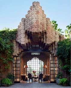
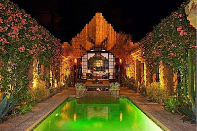
The central courtyard of the Sowden residence. 
I caught a brief flash of architecture during a promo spot for the upcoming TV series I Am the Night starring Chris Pine and Patty Jenkins. It was the Sowden residence designed by Lloyd
Wright, Frank Lloyd Wright's son. It looks like the house features prominently in the limited series starting January 28, 2019 on TNT.

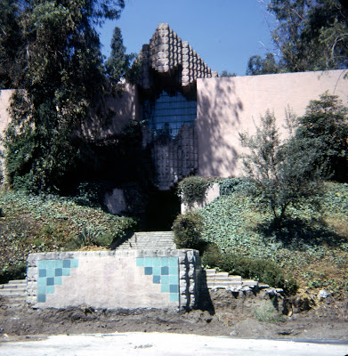
The first time I saw this Lloyd Wright masterpiece, before renovation. 
The Sowden residence, built in 1926, is a quirky landmark on Franklin Avenue. This is the Los Feliz neighborhood, contiguous to Hollywood and not far from the senior Wright's more famous projects, the Ennis house (1924) and the Hollyhock house (1921). You may notice similarities to the Ennis house in my previous blog entry.

The Sowden project is an enigmatic landmark, with only a glimpse of the facade visible from the street. The architecture, usually described as Mayan revival, is closed and secretive. Exotic and mysterious, shrouded in thick vegetation it could easily be a pagan temple from an Indiana Jones movie. Rarely are its interior secrets revealed to the public; it looks like they will be fully exposed in this new TV production. The plot is a fictionalized account of the notorious Black Dahlia murder mystery of 1947.

The Sowden house has endured several ownerships. At the time of the Black Dahlia case it was owned by a corrupt Hollywood doctor, George Hodel, who was actually a suspect. That sordid tale is recounted by Hadley Meares in an fascinating on-line article.  This is worth reading before seeing the TV series, just to keep the facts straight.

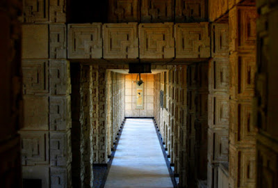
The Sowden residence was recently restored and listed for $4.888 million. You can explore the house virtually by clicking this link to a 3-D walkthrough used to market the house. Another interesting thing to try is exploring the Sowden residence form the air using Google Earth (5121 Franklin Avenue, Los Angeles). What appears to be a very complicated piece of architecture in photos is actually quite simple. The schema is a rectangle with a flat roof. A courtyard is carved out of the center with all major rooms opening to it. This explains the blank walls on most of the exterior. Front and rear, two high-pitched roofs animate the architecture with Churrigueresque-like decoration against planar surfaces.

The Sowden residence is one of the most unusual homes in America. But it is a perfect fit for Los Angeles.
Vintage photo.
Lloyd Wright's floor plan and east side elevation.
Recent photo from the courtyard looking in.
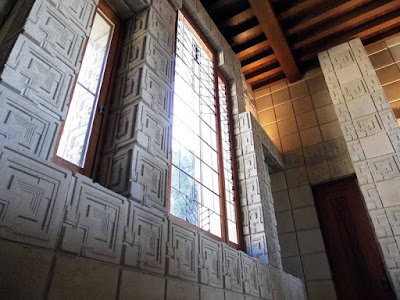
The living room. 


Tuesday, July 24, 2018

Architecture For Sale


One of my favorite houses is for sale. If only I had $23 million.

The 1924 Ennis house in Los Angeles, designed by Frank Lloyd Wright, is on the market. It is recognizable to many people from films, playing prominently in Bladerunner (the original) and Day of the Locust, among many others. It was even used in a Michael Jackson music video. The house is very noticable from the streets below its perch in the Los Feliz district of LA. The Ennis house, named for the original client, looms above Sunset Boulevard like a Mayan temple. It is one of several concrete block houses designed by Wright for Los Angeles clients in the 1920s. It is also the biggest.


The Ennis house was in danger of being lost to architecture afficianados due to earthquake and mudslide damage. For a time the city of Los Angeles owned it, but never found the resources to adequately restore it. The current owner and seller, billionaire Ron Burkle, has pumped a sufficient amount of money into stabilizing and restoring this classic design. By Los Angeles standards it is no doubt worth the asking price.


I don't know why this is one of my favorite houses. There is something very exotic -- almost decadent -- about it, even for Wright. I feel a little guilt for liking it. The decorative light fixtures and original furnishings have been attributed to Wright, but they don't look like his work to me. I believe they might have been designed or selected by  Lloyd Wright, his son and also an architect. Lloyd assisted his father on the concrete block projects and acted as his local representative. The younger Wright's work tended to Hollywood theatricality, so this makes sense. Other non-Wrightian features are beamed ceilings (Wright almost never used exposed beams), black-and-white ceramic tile in one of the bathrooms, red and black tiles in another, and white travetine in a main gallery. Wright's color schemes were normally earth toned. Perhaps an interior decorator co-opted some of these decisions.  Those design details are a mystery to me. It is no wonder that so many movies have used this Mayan palace as code for intrigue and mystery.

If you have the wherewithal to make an offer, click here for the realtor's website.


Tuesday, April 3, 2018

An Architect Abandons Facebook

I have never been a big fan of Facebook. Years ago the conversation among business people was insistent: "You have to be on Facebook. It's a sure-fire way to generate business leads." The advice was so relentless that I started to feel guilty for not having a presence on Facebook. Eventually, I opened an account, posted a few things about my architectural practice, and let it sit there as a little-visited on-line presence. If people commented on my material I hardly noticed because I seldom visited Facebook. I did gain a few re-connects with some old friends. That was nice, but they probably would have found me anyway with a Google search. The rest of what I noticed on Facebook was mostly pictures of people's dinner food or brags about their vacations. I understand that many people use social media as a way of staying in touch with family and friends. I also hear about people with rare diseases getting information and support they might never have found without Facebook. There are many good and useful reasons to enjoy Facebook. In my case those were not strong incentives. So, when comes the recent revelations of Facebook facilitating unsavory political activity by Cambridge Analytica it was not difficult for me to jettison Facebook from my collection of aps. I thought it would be a good way to protest the insidious and over-sized influence of this platform. A way of removing a thumb from the scale of political debate. I realize for me it was not a great sacrifice; others will have a difficult time cutting the Facebook tether. It won't be the right thing to do for everyone.

I killed my Facebook account last Wednesday. (By the way, account death does not happen immediately. Apparently, Facebook needs time to ruminate over my decision. Weeks, in fact. I don't know why.) That afternoon I heard commentary on the radio that for every 100,000 users in the United States who may quit Facebook, there are 100,000 new users in India who replace us every day. Outrage and protestations in the U.S. are not going to put a dent into the billions of users Facebook profits from worldwide. My feeble protest felt like a finger in the dike against a tsunami of mis-information threatening the foundations of reality.

That last sentence is not hyperbole. Think about what Facebook actually allowed to happen: Cambridge Analytica mined tidbits of Facebook data to identify (through psychographic profiling) those likely to be influenced by false and/or one-sided information in support of presidential candidate Donald Trump. This statistical knowledge was used to create an on-line environment that presented one-sided "facts" and "news" that encouraged and disseminated a Trumpian view of the world. This was done with the intent of creating a sense of outrage among likely Trump supporters that would nurture their votes.

Some will say this is simply a form of advertising for a political product. No. This is not advertising. Advertising looks like advertising. Cambridge Analytica created a cyber environment where opinions masquerade as facts. This is a world where low-rent prejudices commandeer debates. Where conversations become shouting matches. That is not advertising, nor is it possible to identify it as such. This was done in secrecy.

A woman was quoted on the evening news, "I don't worry about my data being mined... I have nothing to hide." Others have said they're not influenced by things they see on-line; they simply don't pay attention to it. Both of these positions miss the point. This is not about any particular individual and their on-line experiences. This is a dark game of statistics and algorithms. Cambridge Analytica was able to gather millions of innocuous data points in order to identify likely Trump voters and people sitting on the fence. They didn't advertise to these people. Instead, they literally changed the digital world these people saw without their knowledge. Cambridge Analytica created an alternate reality for these particular people. How many Trump voters did this drive to the polls? That is unknowable. But common sense tells us it was some number of people. In a close election, did that make a difference?

The monetary worth of Facebook is $500 billion. Owner Mark Zuckerberg has a personal worth of $64 billion. (!!!)  These numbers have been dented in recent days by a stock sell-off, but Facebook will certainly rebound. Other corporate behemoths have similar wealth. Google, Twitter, Amazon, YouTube, Apple. Wealth is power. As we have recently learned, much of that power is exercised in secretive and hidden ways. If the singularity (look it up) is imminent, we need to get a handle on the tech giants who run our world in order to direct our own futures in a positive direction. To be explicit: a handful of corporate entities have created an information monopoly. They have the potential to run amok and need to be regulated. Just as the monopoly of ATT was broken up at the beginning of the cyber era, perhaps these monopolies of the new millennium should at least be regulated.

This is the first article I've written that strays from the stated purpose of this blog. There's nothing here about architecture. There's not even a picture of a building. I feel this subject is so important that other matters are trivial. I will no longer use Facebook as a promotional tool for my architectural work. But I still have this blog. And I post occasionally on Instagram. Oh, wait a second. Instagram is owned by Facebook. And this blog is run by Google. I surf the web on Apple devices linked by their iCloud. Yikes! Is it already too late?

The issue is controlling the trafficking in human data. This is a new kind of corrupting power.

Twenty-first century technology is not inherently bad. Many beautiful things are possible because of it. I would like to end this discussion on a positive note. I don't have an image of a remarkable work of architecture to illustrate this article, but here is one of the most stunningly beautiful images I have seen in recent years in any category: the simultaneous landing of two rocket ships by Elon Musk's Space X corporation. This is the good we are aiming for in our techno-cyber world.
SpaceX simultaneous vertical rocket landing. 

Friday, March 2, 2018

The Architecture of Power 3: The Supreme Court

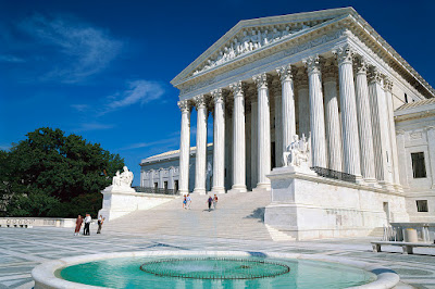
The triad of American government is the Congress, the President, and the Supreme Court. These are established as co-equal branches of government. The Capitol building and the White House are the architectural edifices housing the first two. The remaining seat of power is the Supreme Court building. The architect for the Supreme Court faced a big challenge: how to make a building with relatively few programmatic requirements look as important and commanding as the other two loci of power.
Main facade of the Supreme Court building by architect Cass Gilbert. 
The Capitol building houses 435 representatives and 100 senators, plus an immense support staff (a substantial part of our bureaucracy), lobbyists, and the constant flow of journalists.  There is a lot going on in the Capitol, which is why it has expanded over the years with multiple additions and updates.  The Capitol is an ungainly, bloated edifice after accreting power for over two centuries. The architecture struggles gamely to cohere the sprawling results of multiple expansions.
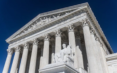
The Contemplation of Justice by sculptor James Fraser.
The Authority of Law by sculptor James Fraser.
The design of the White House, on the other hand, downplays the immense power of the presidency, even though the administrative functions it houses are equally immense.  The President is, after all, a man of the people, not a king. The design strategy has been to minimize and disguise the numerous renovations, additions, and expansions. The White House still looks like a home, not the sprawling office building it mostly is.
The pediment contains nine figures by sculptor Robert Aitken in the manner
of Greco-Roman architecture. 
The Supreme court has specific and clearly defined powers that do not require much space - not in comparison to the former two branches of government.  After all, what does the Supreme Court need?  It is only nine people, plus staff. It has a library and meeting rooms, but no massive support bureaucracy. The architectural challenge for the Supreme Court building is to create a presence that can stand equal to the other arms of government.  Surprisingly, the architectural results are up to the task.
The floor plan reveals four open air courtyards. 
Originally the Supreme Court had no building of its own. The building we see today was commissioned by Congress in 1929. Chief Justice (and former President) William Howard Taft convinced Congress that the Court needed its own digs. Cass Gilbert, who had designed several state supreme court buildings, was chosen as architect. Though known for neo-Gothic architecture, Gilbert employed the neo-classical style for the Supreme Court.  By the 1930s, neo-classical architecture was so closely identified with governmental power he could hardly take any other route. Designed by one architect in a short period of time, the Supreme Court building does not suffer from the additions, remodelings, intrusions, and rebuilding that burden the other two branches of government. The Supreme Court building is a beautifully coherent composition. Powerful in its simplicity, it seems fitting for a court of law. We expect clear and well-grounded decisions from this clear and well-grounded building. We do not always see such clarity of purpose in Supreme Court decisions, but at least we get a sense of that ideal in the architecture. One device used by the architect to expand the apparent size of the building is a series of four courtyards hidden from street view. Cass Gilbert increased the apparent mass of the building by devoting nearly half of its footprint to...nothing.
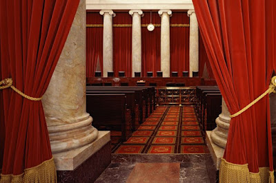
Organization of the main room of the Supreme Court. 
Where solemn chamber where the nine Supreme Court justices take their chairs. 
The heart of Washington D.C. is the Mall. One of the great urban spaces in the world, it stretches nearly two miles in length. The east end is bordered by the Capitol building, the middle by the White House, and the remainder is bordered by our most important museums and monuments. Nowhere to be seen is the Supreme Court building. This is a significant symbolic oversight. The three pillars of our government, supposedly equal in power and authority, are not equally represented in our most important civic space.  The Supreme Court is tucked away behind the Capitol, out of sight and out of awareness. This, in my opinion, is an enormous planning flaw. This is hardly Cass Gilbert's fault, of course. But one would logically expect to find the Supreme Court located at the site of the Lincoln Memorial or, perhaps, at the Jefferson Memorial. Those would be positions of importance equal to the White House or Capitol. Nevertheless, the architecture of the Supreme Court successfully conveys calm equanimity and power. The architecture is successful, even if the siting is not.
Main gallery in the Supreme Court Building. 
The Supreme Court building was brought in under its 9.74 million dollar budget. In fact, the treasury received a $94,000 refund upon its completion in 1935.

Tuesday, January 30, 2018

The Architecture of Power 2: The White House

If the Capitol building is a symbol of a powerful nation (see previous blog entry), the White House is the symbol of a powerful individual, the President of the United States.
White House stationery.

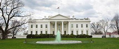
The White House is interesting as much for what it is not as for what it is. The White House, as signified by name, is not a palace. It is not a castle. It is not even called a mansion. It is a house. (Although it should be noted that early appelations referred to it as the President's Mansion or the President's Palace.) As seats of power go, it is comparatively humble, meant to reflect the idea that our President is a man of the people. He is not a king or sultan or dictator. We do not have, therefore, something like Buckingham Palace with its brutally imposing facade and massive size.  Where palaces of potentates are deliberately intimidating and seemingly impenetrable, the White House is gentle by comparison. The grounds are bucolic and welcoming; most powerful administrative functions are downplayed. It presents a domestic visage. The Oval Office, the epicenter of power, is tucked to the side of the main quarters. Other important functions are shifted to to the executive office building. (An exceedingly ugly and ornate Victorian structure a block away). The core of the White House looks like a white house, not the nexus of national and international activity it certainly is.  Sure, it is a mansion, but a mansion not much different than your local run-of-the-millionaire might inhabit. The leader of the free world lives here, but that fact is cleverly downplayed.
The north facade looks like a two story building. Note how the east and
west wings and third floor are barely visible. 
Earliest known photo of the White House. (South Lawn.)
This self-effacing White House is a deliberate illusion.  The under-played west wing is one device that keeps the main house looking like a "simple" mansion. The third floor above the main house is downplayed as an incidental attic, set back from the outer walls and mostly hidden behind a Palladian balustrade. In reality, it houses full size rooms put to various support purposes.  Major functions are hidden from public view, including extensive basement bunkers and tunnels, and certainly a lot of things to which only the secret service is privy.

The White House structure is much more complex than first meets the eye.  At a glance it appears to be a two-story home.  In reality, the ground plane has been manipulated so the ground floor is hidden from view on the north (front) elevation.  The "first" and "second" floors are raised a full story above natural grade. The apparent attic is essentially a fourth story.  Two levels of basement below the ground floor make this a six story enterprise - half of it hidden or disguised.  Contiguous with the main building, the west and east wings are attached by the ground level and basement, visually diminishing their true importance and extent. It is all very clever.
White House interior during the Truman renovation.

The basic form of the current White House can be attributed to the Truman renovation constructed from 1949 to 1952.  When Truman took office, the White House, without exaggeration, was a wreck. Things were so rotted and shaky that Truman claimed there was imminent danger of his bath tub crashing through the second floor while the Daughters of the American Revolution were having tea in the room below. He would be forced to greet them "wearing nothing more than reading glasses." Indeed, in 1948 a leg of Margaret Truman's piano actually crashed through a second floor sitting room through the ceiling of the dining room below.

The White house had been altered many times to accomodate the tastes and preferences of different administrations. Most notably, perhaps, was the restoration after a major fire during the War of 1812.  But the Truman renovation created the basic shape of the White House we know today. This rebuilding preserved the outside walls of the White House, but not much else.  This extent of rebuilding is quite obvious in period photographs.
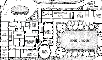
Schematic overview of the White House complex. 

Detail plan of the west wing. (Reversed and up side down from the preceding drawing.) 

Like the Capitol building, the White House is an icon of political power. As such, it is almost impossible to judge as architecture. What can we say about the design? It succesfully uses architectural  deceptions to hide its true size. It is an textbook example of neo-classical residential architecture, completely in tune with the architectural fashion the late sixteenth century. The original design was created by architect James Hoban, selected by George Washington in a competition.  (Thomas Jefferson had anonymously submitted a competing design.) In the end, is it good architecture? Maybe. Probably. But that is overshadowed by everything else it represents.
Basic plans of the first and second floors. 
The home of the president of the United States is an awesome presence in Washington D.C.  Perhaps we should be grateful it's impact has been somewhat tempered by design lest any self-centered, duplicitous, megalomaniac president assume more power and authority than is actually allowed the office. One can hope.
This aerial view reveals the attic addition as well as part of the ground level.
There are two additional basement levels. 


Monday, January 15, 2018

Sometimes Old Architectureecture is Best

A recent trip to Los Angeles provided an opportunity to visit some old buildings that few people take the time to see. Here are a some of my favorites.

1. A mid-century modern gem is the Avalon hotel, located a few blocks south of Rodeo Drive in Beverly Hills. I love this place, a boutique hotel that eschews the frenzy and size of better know venues. The Avalon boasts a classic kidney-shaped pool in its courtyard, flanked by a groovy restaurant and balconies overlooking it all. It is an intimate place, convenient to all of the central LA basin. Modern updates respect the original architecture without mothballing it.  Marilyn Monroe reportedly stayed here in the 1950s.
Avalon hotel, Beverly Hills. 
2. Everybody disdains downtown L.A.  I rather like it. It is no longer a forgotten corner of the city that seemed dangerous and shabby.  Okay, it's still a bit shabby and, frankly, boring.  But it's no longer forgotten.  New high-rise apartments flank the edges of downtown and old bank buildings on Spring Street are being converted to stylish lofts. Several subway lines now link downtown with Hollywood, Santa Monica, and other far-flung neighborhoods. Granted, it lacks shopping and restaurant magnets, but the original Grand Central Market still serves downtown as it has since 1917.
Grand Central Market, downtown L.A.
3.. L.A.'s grande dame of hotels, the Biltmore, is one downtown destination that still is worth seeing. It demonstrates the truism "...they just don't build 'em like they used to." It is richly detailed in its very accessible lobbies (yes, there are more than one), grand tavern, meeting rooms, and galleries. It is the kind of place that makes a visitor feel like royalty.
Biltmore lobby. 
Biltmore lobby.
Biltmore ceiling.
Biltmore chandelier. 
Biltmore lobby.
Biltmore lobby bar. 
4. Broadway, in downtown L.A., was once a street of many lavish movie palaces.  The buildings are still there, but, sadly, mostly abandoned. Occasionally they are used (interiors and exteriors) for movie locations.  For the most part they are probably destined for the wrecking ball.  Enjoy them while you still can.  Also on Broadway, and lovingly restored, is the Bradbury building.  Built in 1893, it  is one of the earliest examples of a skylit atrium building with exposed elevator cages. This was created nearly a century before John Portman brought the concept to the Hyatt hotel chain. Architecture students know this building from their history classes. Film buffs should know it from numerous location shots, including the final scenes of Bladerunner.
Theater on Broadway.
Bradbury building.

Bradbury building.
5. Union Station is a Spanish revival building that still has real train service.  Also the nexus for two subway lines, it has gained a renewal of purpose that attracts bustling crowds as it must have during the heyday of travel by train.
Union Station. 
Union Station.
6. Finally, what could sum up Los Angeles better than a classic movie studio. Paramount still has its main gate, featured in numerous film classics including Gloria Swanson's famous scene in Sunset Boulevard. If you take the studio tour you get two cities for the price of one.  "New York City" is recreated as faćade-only buildings in sunny Los Angeles.  (Usually sunny.  It was raining that particular day.)
Paramount studios entrance gate. 
"New York City."
It's only a movie set. 

All photos : MJK with an iPhone 6.