Showing posts with label Design Ideas. Show all posts

Wednesday, December 21, 2022

New Video Channel: ARCHITECTURE MINUTE

Launched this month is my new YouTube channel, Architecture Minute. Like this blog, the channel explores all facets of architecture, including architectural history, philosophy, and new ideas. Iconic buildings and important architects are also part of the mix. The great thing about a video format is, of course, the expanded ability to present the visual aspect of architectural appreciation. 

There are many vlogs about architecture, including some with similar titles. (There are only so many pithy words you can combine with architecture!) It would be a great help to my efforts if, once you find my videos, you LIKE (the thumb-up icon) and SUBSCRIBE to the channel. If you're like me, it's kind of an annoyance to be asked to commit to yet another electronic "like". But that is the only way my YouTube channel will be searchable through the inscrutable algorithems of Google and YouTube. Please LIKE and SUBSCRIBE. It costs nothing. Sincere thanks!

The first season of Architecture Minute is ten episodes. In truth, with introductions and end titles, each episode is more like two minutes, but "architecture two minutes" is not very catchy. Forgive my temporal license. Architectural concepts explored in the first season are rhythm, focal points, and articulation. Also discussed are three architects responsible for inventing Mid Century Modern architecture: Mies van der Rohe, Corbusier, and Frank Lloyd Wright. Each episode is a simple lesson in architecture. It is my hope that everyone who has an interest in architecture will find something of value. In particular, young people starting out in architecture, or simply curious about it, will find this a great introduction to what architecture is or could be. 

Naturally, I invite your comments and suggestions. And please remember to LIKE and SUBSCRIBE!


Saturday, June 27, 2020

LaVerne Lantz Architectural Biography Now Available on iBooks

My updated and expanded monograph, LaVerne Lantz -- An Architectural Biography, is now available on iBooks. This is Apple's book ap, also known as Apple Books or Books. If you have an iOS device (iPhone, iPad, Mac) the ap is available for free in the ap store. Find this book by searching Michael Knorr or LaVerne Lantz. 

This monograph was originally inspired by a tour of architecture in southeastern Wisconsin by Frank Lloyd Wright Wisconsin, Inc. The tour, dubbed Wright and Like -- Driving Mr. Wright, was held in June of 2014 and is an annual event. The 2014 tour featured two Frank Lloyd Wright homes as well as projects by other architects who are "like" Wright. Included were five homes by a relatively unknown home designer, LaVerne Lantz. 

The current version of this "architectural biography" has been expanded with additional text as well as more photographs and drawings. 

The mid-twentieth century saw an effusion of modern architecture. Mid-Century Modern design was in the air across America when LaVerne Lantz started to become aware of architecture. After completing a few fledgeling projects, his commissions came to him by word-of-mouth referrals. He never compromised his design philosophy; as a result, every Lantz design is a clear testament to his well-developed sense of what a house should and ought to be. Every Lantz home is a confident expression of internally consistent design principles and coherent themes. Despite the high quality and integrity of LaVerne Lantz's body of work, it is largely undocumented. This monograph serves to remedy that omission in architectural history. Any fan of Frank Lloyd Wright and aficionados of Mid-Century Modern design will appreciate LaVerne Lantz's original take on the principles of organic architecture. 

Friday, November 4, 2016

Architecture Podcast

Our friends at Mountain View Windows and Doors run a regularly schedule podcast about architecture, design, building, and business. The Art of Construction podcast continues to grow and develop and has become the #1 podcast on iTunes for contractors and architects.  With their increased success they have decided to give it is own home/website: the art of construction.net. 

With this is mind, the link to their interview with Michael Knorr has also changed: http://www.theartofconstruction.net/episode-38-with-michael-knorr.

Podcast hosts Kevin Keefe and Devon Tilly.

Tuesday, April 2, 2013

Architecture is Like the Movies

One of the best architecture magazines on the market today is Hospitality Design, published by Nielson Business Media. It is a trade publication that specializes in hotels, restaurants, resorts, and spas, intended for professionals who design or manage such venues. While not specifically an architecture magazine, it features architecture and interior design regularly and lavishly.

The hospitality industry is highly competitive. To stay on top, popular venues are revamped every few years. The half-life for architecture and interior design in the hospitality game is short. New ideas are introduced at lightening speed and creativity thrives in this environment. At top restaurants in New York and L.A. and big resorts on the Vegas strip, there are ample funds to support leading edge ideas. Good design is used as a marketing tool without hesitation - in fact, with a sense of obligation. For these reasons, Hospitality Design features exciting architectural concepts in nearly every issue. It is a "must read" for me.


I was struck by a statement in a recent issue by hotelier Grace Leo: I see myself as a movie producer - but I produce hotels. I orchestrate everybody's efforts to make the vision a reality.


Comparing the creation of a hotel to making movies strikes close to home.  I have often used the simile, aarchitecture is like the movies.

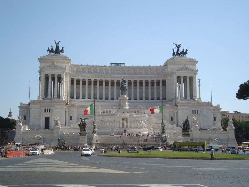
Architecture is a complex art. It interweaves the talents of many different professions, trades, and consultants. Like the movies, all of these entities must work in concert at top capacity to produce a hit. A great movie must have a great script (the design) but also a willing client (the producer), talented actors (craftsmen), and a capable director (the builder). Add to this the many extras, bit players, FX artists, etc. that are necessary to make a movie and to make architecture. If any part of this assemblage falls short, a movie will be less than a blockbuster and a work of architecture will scar the landscape.  The movie world does not want another Water World. The built
Victor Emmanuel Monument. A study in architectural excess.
environment does not need another Victor Emmanuel Monument.


When Hollywood has a premier, everybody notices, but nobody has to watch.
When a building has a premier, it is hard to avoid and
it tends to stick around for a long time.
The simile is also something of a plea for tolerance for those works of architecture that fall short. Sometimes good architects produce bad works, but it is not always the architect's fault. Interior design can make a a good building look bad or a bad building look good. Landscape architecture can do the same. The budget has to be sufficient. The client must be willing and, sometimes, brave. This is not an excuse for architectural misfires, but a recognition of the importance of assembling the right team. Quality, talent, commitment go a long way in making good movies. They are requirements for good architecture. 

It is tempting to think of architectural successes as a brilliant tours de force that spring from the minds of lone auteurs. Certainly, credit should be given to great talents when it is due. In reality, however, the list of credits is usually quite long. 

Monday, March 25, 2013

Architecture and Living in the Future

Yesterday my business networking group met at the showroom of Exquisite Kitchen Designs. We were dazzled by the way technology has insinuated itself into the design, manufacture, and utility of kitchens.  The new kitchens we are installing in luxury homes are glimpses of a science-fiction future that ultimately will filter down to the average residence. 

It often feels like we are living in the future we imagined decades ago. In many respects we have surpsassed our imperfectly imagined future. Disneyland's World of Tomorrow exhibit  has long been dismantled because it couldn't keep up with the real future that was happening around us.

Today I ran across this video - an extended ad for Corning Glass. This glimpse of a techno-friendly future (all of the technology shown in the video is possible right now) is worth a look. Pay attention to the backgrounds as well as the products. This is a future of sumptuously modern architecture.


Thursday, November 29, 2012

Half-A-Cup of Architecture

There is a shopping center near my house that is nice enough, as shopping centers go. It has a quasi-prairie style demeanor with hip roofs and broad overhangs. It supports a useful assortment of shops: Pier One, Petsmart, a couple of banks, and the obligatory Starbucks.
A neighborhood shopping center.
The architecture softens a big box venue, Office Max, as well as can be done. But every time I visit the center I'm disappointed by a potentially good design that has dropped the ball. The hip roof motif looks great from certain angles (head on) but from other vantage points the hip roofs are severed like useless appendages. Worse: when viewed from the rear, the hips turn into aluminum-paneled gables.
Phantom hip, above.  Details, below.


Some people view things as a cup half full and others as a cup half empty. Either way, these chopped-off hip roofs are half-a-cup of architecture. They are incomplete; fake; deceptive. Obviously, these phantom roofs are a way to simplify (cheapen) the design. The architects probably thought we would never notice. They appear to have succumbed to a common pitfall amongst architects and developers: designing a building from the front, forgetting that we live in a three-dimensional world. This shopping center sprawls over three city blocks, surrounded on four sides by busy streets. It is impossible not to see the architecture from all sides.
Main street in an old west town.
The set for Mel Brooks's Blazing Saddles.
We are constantly exposed to this type of facade-ism: buildings designed like storefronts in a western movie. A Flatland world where a building is imagined to exist only in one dimension. Then we turn the corner and realize half of it is fake. A pretentious facade designed to make us think the building is more important than it really is.

A "spec" house under construction.
We are inundated with this attitude in residential architecture. Many houses are built with brick facades facing the street and cheaper materials around the sides. This is so common we don't think much about it anymore. It has almost become a style in itself. Maligned by thinking architects over the years,  facade-ism is sometimes addressed (somewhat defensively) by taking a wee bit of brick around the corner (see, we really are three-dimensional) but then suddenly quitting the more expensive material for something cheaper. This strategy can work only if the expensive material ends in a graceful way, such as at a jog in the building or by completing a column. All too often it is an empty gesture that only emphasizes the haplessness of the architect and/or the developer. Better to leave the brick off altogether than expose the vacuity of style in a half-hearted attempt at three-dimensional thinking.

Kinda makes you thirsty for a full cup of architecture.
Reductio ad absurdum: a storage shed in facade-ism style.

Thursday, September 20, 2012

Women in Architecture


When I entered architecture school at the University of Oklahoma there was one woman in my class. During our freshman year she was taken aside by a professor/advisor and told "there is no place for women in architecture." She was advised to drop out or change her major.  This seemed shocking to me, but it was Oklahoma. And it was a long time ago.
Fast forward to the twentyfirst century and times have changed. Women are underrepresented in the field of architecture, but they are certainly not a rarity. However, young women considering a career in architecture still need role models and inspiration. For those reasons, I am pleased to post the following news release of a lecture by a very talented architect, Stephanie Forsythe. 

STEPHANIE FORSYTHE LECTURE AT WOMEN IN DESIGN’S FALL MEETING AT THE DIKEOU POP-UP SPACE
Annual event to be held Wednesday, September 26th 2012 with a reception starting at 5:30 p.m.
DENVER – September 12, 2012 – Women in Design (WiD), a Denver-based non-profit dedicated to improving opportunities for women in professions serving the built environment, welcomes Stephanie Forsythe, owner and principal of molo studio as the featured speaker at its fall lecture. The lecture will be held the evening of September 26th at the Dikeou Collection Pop-up Space located at 1321 Bannock Street in the Golden Triangle neighborhood.

Softwall #1.
Forsythe is an internationally recognized and award-winning designer and Canadian architect who incorporates research of materials into the exploration of space making. As a design and manufacturing studio, molo’s goal is to create objects that “define intimate temporal spaces”. Based in Vancouver, molo's high-profile projects include The Northern Sky Circle, an outdoor room made from snow in Anchorage Alaska and the Aomori Nebuta House, a cultural building inspired by the craftsmanship and spirit of the Aomori Nebuta Festival in Japan. In addition to these architectural collaborations, molo designs and creates products that house people and enhance our spaces, such as softseating, made from 50% recycled fiber kraft paper and softwall, which provides a tactile experience to defined spaces. Though designed for long-term use, softseating is 100% recyclable and has magnetic ends, allowing it to be adjusted to fit to various spaces and needs, or connect to itself to form a cylindrical stool or low table or long winding benches. Made of tissue paper, softwall uses a honeycomb structure that expands to create a completely freestanding wall, hundreds of times larger than its compressed form. It provides translucent light or a more “cocooning” experience depending on the choice of white or black tissue paper. More information on molo’s projects and products can be found at molodesign.com.

“WiD is thrilled to have Forsythe speak at our premier event. She’ll share her unique perspective of product design and space making by presenting work created for clients around the world. It’s a rare opportunity to see such a presentation in Denver,” said Cheryl Bicknell, co-chair of WiD. WiD will host a reception starting at 5:30 p.m. with the lecture to follow at 6:30 p.m.
Nebuta House.
Tickets are $20 for WiD members and $35 for non-members. Members must log on to widdenver.org to receive the discount.

Event sponsorship opportunities are available, with additional details on WiD’s website or from the contacts listed below.

Founded in 2005, WiD is a network nearly 200-members strong and growing. For more information about Women in Design, please visit
widdenver.org or contact Executive Co-Chairs Cheryl Bicknell or Jennifer Gray at cheryl.bicknell@widdenver.org or jennifer.gray@widdenver.org. 
Nebuta House.

Tuesday, September 18, 2012

Architecture Redux

Original front entry, now undergoing reconstruction.
Life seldom offers a second chance. Unless you hang around long enough in the world of architecture. Lately, I have had the pleasure of reworking several of my earliest projects. Some are for new owners who have different needs. Others are for original clients whose families have grown and now have a different program for their architectural environment. And some properties are simply in need of a twenty-first century facelift. It is a honor to be involved in all of these. There is probably not an architect alive who wouldn't welcome the chance to rethink aspects of any project the moment it is completed. That is why Frank Lloyd Wright always answered, "The next one," when asked which project was his favorite. One of my "second chances" is an extensive remodel and additions for a project I designed twenty years ago in the mountains outside of Denver. The new owners want to expand the floor plan with larger terraces, a new atrium, and a guest house. This was also an opportune moment for new windows, new exterior cladding, and interior updating. The kitchen and baths, in particular, were ready for a fresh look. These changes led to rethinking the fireplaces, flooring, and ceiling treatments. As a result the structure is now stripped to its bones and on its way to a completely different look. It became an opportunity to introduce new materials (Wisconsin limestone), new products (patio doors that pocket into the walls), and a new attitude to the interior design. Since most of the structure had to be stripped bare to implement the new design, the owner also decided to replace the mechanical and electrical systems. We are adding air conditioning and in-floor radiant heat. Light fixtures are being replaced with products that didn't exist when the house was built. In the end, this will not be a remodeled house, but a new one. The original owners were ideal clients, encouraging creativity and innovation. The new owners have been equally enthusiastic about producing a quality project. Their goal is to have a living environment that feels like a destination vacation spot. I am as excited about this new incarnation as I was about the original design.


The house looked like this when built:
Original rear decks.
Long view of original west elevation.
Here is what it looks like today with work in progress:
Stucco is removed; decks and original greenhouse are gone.
Plywood protects openings that led to original greenhouse.
Orignal multi-level decks are removed.
Here are our drawings for the redesigned project:
Perspective showing original house in background, new atrium (replacing greenhouse) on left,
new guest house on right., new deck in foreground.
New exterior elevations. Completed house will be Wisconsin limestone and stucco.
Main level floor plan with new additions shaded.
The original house won a MAME award for House of the Year and was published in The Rocky Mountain News. 
The Rocky Mountain News. 
We are aided in this effort by interior architect Claus Ranemacher, New York City. The structural engineer is Foothills Engineering, Boulder, Colorado. The builder is Mark Manley, Golden, Colorado. 

Updates of the finished project will appear on this blog in 2013.


Sunday, September 16, 2012

Renaissance Architecture of the Air


Renaissance architects manipulated architecture for sensory pleasure and intellectual delight.
Filippo Brunelleschi, architect.
One of the intents of Renaissance architecture was to control the perception of space through the arrangement of mass.The key word here is perception. To Michelangelo, Brunelleschi, and Palladio, architecture was not about picture-perfect images. It was about the perception of space in real life.
Brunelleschi's dome, Florence, Italy.
A recent article by Gregory Karp in the Chicago Tribune indicates this philosophy of space - dating to at least the renaissance in architecture - is now understood by those who design the interiors of airplanes. 
Boeing Sky Interior.
New airplanes are being outfitted with interiors that address the perception of space in environments normally perceived as cramped and claustrophobic. Even in coach, the new Boeing 737 planes, for example, "are likely to have the Boeing Sky Interior," reports Karp, "which evokes a greater sense of space." Boeing's regional director in Chicago, Kent Craver, cites this as "a step change in our interior philosophy" because passengers have an emotional reaction to the airplane simply based on the way it looks. BINGO! That is what Renaissance architects knew about space five centuries ago. 

Monday, October 24, 2011

Modern Architecture Tour

The first Denver Modern Home Tour was a success! We want to thank the four-hundred-plus people who took time to visit our property on Saturday. All were friendly and generous in their appreciation for modern architecture. I am sure the perfect autumn day contributed to the good mood everybody seemed to share. I enjoyed many conversations throughout the day. It is gratifying to realize how interested people are in good design. It was also fun being interviewed on KWGN Channel 2 before the tour. 

The tour creator, Matt Swinney, was delighted with the results and intends to return to Denver next year with an even bigger event. Meanwhile, his organization, Modern Home Tours, LLC of Austin, TX, has other tours planned. The next one is November 12th in Houston. For information follow this  link: 
http://houstonmod.modernhometours.com/
Garden in Houston.

Wednesday, October 12, 2011

Denver Modern Home Tour

MICHAEL KNORR & ASSOCIATES is honored to be selected for the first-ever Denver Modern Home Tour.
1. Denver Modern Home Tour.
On Saturday, October 22, 2011 from 11:00 am - 6:00 pm, join us to tour 8 of Denver's most recent examples of contemporary residential architecture. We have previewed all of the properties and think you will find something interesting at each location. There is a broad array of design choices, sizes, and neighborhoods. 

Please come by our featured property, 4501 E. Dartmouth, during the tour. For advance TICKETS go to this link: http://denver.modernhometours.com/

For a MAP and INFORMATION on all eight homes go to this link: http://denver.modernhometours.com/tour-homes/

We look forward to visiting with you on the 22nd!

2. Denver Modern Home Tour.
Photos:
Rob Munger

Sunday, April 17, 2011

Architectural Heat

Outdoor fireplaces and firepits have become popular in the last couple of years. As an architectural amenity they have gone from rare to almost de riguer in new custom homes. Whether this is a passing fad or a permanent standard is difficult to predict. The key to longevity will be how often people really use them. In my Las Vegas home I never used the outdoor fireplace. If the evening was chilly, I was inside. Other people feel differently. I have been at parties where an outdoor firepit was a cozy focus for after-dinner conversation. Another key to success is making this feature an integral component of the architecture. If it is designed well it can be a visual focal point and a magnet for activity. Here are a few random firepit examples culled from the internet. Some are manufactured products, others are custom designs. The manufactured products availble at garden centers and furniture stores start as cheap as $400 and go up to $4000 and beyond.