Showing posts with label Philosophy. Show all posts

Wednesday, December 21, 2022

New Video Channel: ARCHITECTURE MINUTE

Launched this month is my new YouTube channel, Architecture Minute. Like this blog, the channel explores all facets of architecture, including architectural history, philosophy, and new ideas. Iconic buildings and important architects are also part of the mix. The great thing about a video format is, of course, the expanded ability to present the visual aspect of architectural appreciation. 

There are many vlogs about architecture, including some with similar titles. (There are only so many pithy words you can combine with architecture!) It would be a great help to my efforts if, once you find my videos, you LIKE (the thumb-up icon) and SUBSCRIBE to the channel. If you're like me, it's kind of an annoyance to be asked to commit to yet another electronic "like". But that is the only way my YouTube channel will be searchable through the inscrutable algorithems of Google and YouTube. Please LIKE and SUBSCRIBE. It costs nothing. Sincere thanks!

The first season of Architecture Minute is ten episodes. In truth, with introductions and end titles, each episode is more like two minutes, but "architecture two minutes" is not very catchy. Forgive my temporal license. Architectural concepts explored in the first season are rhythm, focal points, and articulation. Also discussed are three architects responsible for inventing Mid Century Modern architecture: Mies van der Rohe, Corbusier, and Frank Lloyd Wright. Each episode is a simple lesson in architecture. It is my hope that everyone who has an interest in architecture will find something of value. In particular, young people starting out in architecture, or simply curious about it, will find this a great introduction to what architecture is or could be. 

Naturally, I invite your comments and suggestions. And please remember to LIKE and SUBSCRIBE!


Tuesday, March 16, 2021

Architectural Symbolism and the Sacking of the Capitol

In the past I have criticized the architectural merits of the United States Capitol. In playing architectural critic, I cited the bloated nature of the building: numerous additions have resulted in muddy (at best) proportions and a structure that no architect in his right mind would have created from scratch. But I also acknowledge that it is impossible to offer a fair critique of the Capitol architecture because the symbolism of the building overwhelms objective architectural criticism. The Capitol has long symbolized freedom, democracy, homeland, patriotism, truth, justice, and the American way. Architectural values have little relevance next to the abstract power of the Capitol of the United States of America as an icon. Whether on network news or the letterhead of a congress member, the mere outline of the Capitol Dome instantly communicates the high value people have attached to it -- all architectural criticism aside.  


This symbolic nature of the Capitol is only more clear after the 6th of January day of infamy. The sacking of the United States Capitol carries more weight than any run-of-the-mill riot or building defacement. It was an attack on every value that our democracy is. That is why, in the aftermath of the insurrection, shocked politicians and citizens expressed their dismay about the attack using words usually reserved for religious feelings. It was an assault on the "hallowed halls" of democracy. The building is described as "a sacred space" or "a revered sanctuary" or "a shrine of democracy."  None of this, of course, has anything to do with the physical architecture of the place. It has everything to do with the architectural symbolism of the building. 


During the Civil War, President Lincoln was urged by Congress to stop construction work on the new United States Capitol building. War funds were depleting the treasury and many saw the construction project as unnecessary spending in dire times. Lincoln saw things differently. He knew that the American people needed the symbolism of a completed Capitol. Construction continued. Lincoln, of course, was right. He knew what leaders have always known: people need a tangible representation of their most valued beliefs. The Catholic Church understood this in its ascendancy and used mammoth cathedrals to attract and impress the masses. Queen Victoria understood this when she moved her seat of power to Buckingham Palace where it would be visible to all Londoners. The pharaohs certainly understood this when ordering monuments big enough to ensure their influence even after death. Architecture can be a lasting and powerful tool around which to organize ideas and inspire devotion or -- at least -- respect. 


From TV reporting and a flood of video images, the average American now has more architectural understanding of the Capitol than ever before. We have seen how Officer Eugene Goodman, with his knowledge of the Capitol floor plan, deliberately led marauders away from the Senate chamber. Away from Vice President Pence as the mob frothed with "hang Mike Pence, hang Mike Pence..."  We have seen numerous replays of angry white males bursting into the senate chamber, invading private offices, and smashing doors and windows with abandon. All within the gravitas of marble halls, colonnades, and classical details that we recognize as our United States Capitol. 


Is there some other form of architecture that could carry the weight of all this symbolism other than the Classical Revival building that has been bequeathed to us by history? Of course. Had the Capitol been designed in the twentieth century with modernist materials and details we would probably be in thrall by whatever that building looked and felt like. Or, perhaps, some Art Nouveau confection would be our inheritance. Or maybe a late-Gothic, spire-encrusted building like the British Parliament. Whatever it might have been, if it housed our government it would eventually grow into a symbol of our government and a symbol of who we are as a people. A symbol beyond the reach of architectural criticism. But our founding fathers and subsequent leaders decided that the proper receptacle for a democratic government was Greco-Roman architecture because the Greeks invented democracy. So there we have it. That architecture has been established, repeated, and embellished over the years. As a powerful and rich nation we have had the resources to build and maintain the Capitol architecture in top-notch form. What we see today on TV is a legacy from the past that is alive today.


 All buildings have a spirit in some sense. We have warm feelings about home, religious devotion in church, feelings of excitement in an arena. Under the best circumstances, architecture supports and encourages such feelings. That is the purpose of architecture, as opposed to merely encasing these functions in an ordinary building. For any architect fortunate enough to author a major public building, one hopes they are up to the honor. The symbolism they establish with architecture can be long lasting and very serious. And perhaps it would be good to remember that any outrage we may feel about the January 6th sacking of the Capitol, any fondness we may have about the lavish architectural details, and any heartbreak we have about the desecration of that building is not about the physical construct at all. Our outrage is about the defilement of the ideas which that building symbolizes after centuries of standing unmarred by internal political strife. 


Tuesday, January 30, 2018

The Architecture of Power 2: The White House

If the Capitol building is a symbol of a powerful nation (see previous blog entry), the White House is the symbol of a powerful individual, the President of the United States.
White House stationery.

The White House is interesting as much for what it is not as for what it is. The White House, as signified by name, is not a palace. It is not a castle. It is not even called a mansion. It is a house. (Although it should be noted that early appelations referred to it as the President's Mansion or the President's Palace.) As seats of power go, it is comparatively humble, meant to reflect the idea that our President is a man of the people. He is not a king or sultan or dictator. We do not have, therefore, something like Buckingham Palace with its brutally imposing facade and massive size.  Where palaces of potentates are deliberately intimidating and seemingly impenetrable, the White House is gentle by comparison. The grounds are bucolic and welcoming; most powerful administrative functions are downplayed. It presents a domestic visage. The Oval Office, the epicenter of power, is tucked to the side of the main quarters. Other important functions are shifted to to the executive office building. (An exceedingly ugly and ornate Victorian structure a block away). The core of the White House looks like a white house, not the nexus of national and international activity it certainly is.  Sure, it is a mansion, but a mansion not much different than your local run-of-the-millionaire might inhabit. The leader of the free world lives here, but that fact is cleverly downplayed.
The north facade looks like a two story building. Note how the east and
west wings and third floor are barely visible. 
Earliest known photo of the White House. (South Lawn.)
This self-effacing White House is a deliberate illusion.  The under-played west wing is one device that keeps the main house looking like a "simple" mansion. The third floor above the main house is downplayed as an incidental attic, set back from the outer walls and mostly hidden behind a Palladian balustrade. In reality, it houses full size rooms put to various support purposes.  Major functions are hidden from public view, including extensive basement bunkers and tunnels, and certainly a lot of things to which only the secret service is privy.

The White House structure is much more complex than first meets the eye.  At a glance it appears to be a two-story home.  In reality, the ground plane has been manipulated so the ground floor is hidden from view on the north (front) elevation.  The "first" and "second" floors are raised a full story above natural grade. The apparent attic is essentially a fourth story.  Two levels of basement below the ground floor make this a six story enterprise - half of it hidden or disguised.  Contiguous with the main building, the west and east wings are attached by the ground level and basement, visually diminishing their true importance and extent. It is all very clever.
White House interior during the Truman renovation.

The basic form of the current White House can be attributed to the Truman renovation constructed from 1949 to 1952.  When Truman took office, the White House, without exaggeration, was a wreck. Things were so rotted and shaky that Truman claimed there was imminent danger of his bath tub crashing through the second floor while the Daughters of the American Revolution were having tea in the room below. He would be forced to greet them "wearing nothing more than reading glasses." Indeed, in 1948 a leg of Margaret Truman's piano actually crashed through a second floor sitting room through the ceiling of the dining room below.

The White house had been altered many times to accomodate the tastes and preferences of different administrations. Most notably, perhaps, was the restoration after a major fire during the War of 1812.  But the Truman renovation created the basic shape of the White House we know today. This rebuilding preserved the outside walls of the White House, but not much else.  This extent of rebuilding is quite obvious in period photographs.
Schematic overview of the White House complex. 

Detail plan of the west wing. (Reversed and up side down from the preceding drawing.) 

Like the Capitol building, the White House is an icon of political power. As such, it is almost impossible to judge as architecture. What can we say about the design? It succesfully uses architectural  deceptions to hide its true size. It is an textbook example of neo-classical residential architecture, completely in tune with the architectural fashion the late sixteenth century. The original design was created by architect James Hoban, selected by George Washington in a competition.  (Thomas Jefferson had anonymously submitted a competing design.) In the end, is it good architecture? Maybe. Probably. But that is overshadowed by everything else it represents.
Basic plans of the first and second floors. 
The home of the president of the United States is an awesome presence in Washington D.C.  Perhaps we should be grateful it's impact has been somewhat tempered by design lest any self-centered, duplicitous, megalomaniac president assume more power and authority than is actually allowed the office. One can hope.
This aerial view reveals the attic addition as well as part of the ground level.
There are two additional basement levels. 


Wednesday, August 17, 2016

The Architecture of Power 1: The Capitol Building

The Capitol of the United States.
Buildings are often symbols for something beyond the structures themselves.  Kevin Lynch famously made this argument in Learning from Las Vegas (Robert Venturi, Denise Scott Brown, Steven Izenour; MIT Press 1977).  Lynch's book praised gigantic neon signs as an appropriate architecture for a fast-moving car culture that has no time for diminutive details. In Las Vegas the buildings themselves become signs, using architecture to attract gawkers and gamblers.

Buildings may blatantly telegraph their function. Hot dog stands in the shape of hot dogs. Ice cream shops as oversized canisters of cream. Motels as concrete teepees. These examples are kitsch; they hardly qualify as architecture. Buildings with more august functions usually employ subtle cues to communicate their function. This is when design transcends structure. It is particularly fascinating to contemplate the architecture of power. Can architecture be used to support the very idea of political power? There is no better place to look for an answer than the capital of the free world, Washington, D.C.
Little Man ice cream stand in Denver.
Roadside hot dog in Colorado.
Washington abounds with buildings designed to communicate power, authority, strength. The Capitol building itself is a leading example. An vague image of the Capitol is potent enough to signal power around the world. Whether as a photograph or an abstract logo, the Capitol is universally recognized as a symbol of power. The Capitol is so familiar that even a lean graphic suggesting the capitol dome provides instant recognition and authority. Letter heads, campaign stickers, or government edicts frequently employ the abstraction. It is used as a logo for political talk shows and to market patriotic merchandise of all sorts. Images of the capitol are ubiquitous.


Iconic images of the U.S. Capitol. 
The first Capitol dome, designed by Charles Bulfinch, a Boston architect, was finished in 1824. After Capitol expansions it was considered too small (and a fire hazard). A new dome was constructed to a design by Thomas U. Walter in the 1850s. Eleven Capitol architects have contributed changes and additions over the years. The building has morphed over time; it is impossible to credit authorship to any individual. The accretion of additions has also resulted in the dome looking somewhat like a decoration plopped atop a sheet cake, connected less than elegantly to the elements beneath. Such criticism may seem churlish to some. The symbolism of the Capitol bears almost as much emotional weight as the nation's flag. To criticize it seems unpatriotic. Which brings up the central problem in writing a serious architectural critique of the Capitol: the building is so familiar that it is more of an icon and less of a building. Still, it is architecture and can be viewed as such.
A cake.
How does it stack up as architecture?  To my eye, the proportions are less than graceful. It looks like what it is: an accretion of add-ons and improvements over time by different people for different purposes. The cohesion of the separate elements is tenuous. I once voiced this criticism to a Washington, D.C. resident. He was horrified. What an affront to the city and it's most iconic building! Well, there you have it: the Capitol is an icon... it can hardly be criticized as architecture. As a symbol of power, it is unparalleled in the world. Perhaps it succeeds as architecture in spite of the architecture, because the building successfully communicates its role as the ultimate seat of power.  But a hot dog stand does the same thing in its realm; nobody would seriously call it architecture. This is a discussion that goes in circles without resolution. The Capitol is a prime example of the architecture of power, but it may or may not be good architecture. I believe it is nearly impossible to objectively see the Capitol, hidden behind its veil of political preconceptions and symbolism.

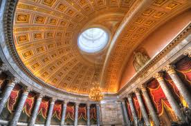
Finally, the interior of the Capitol building is, put plainly, a let down. Without question, other domed spaces are more impressive than the hall under the Capitol dome. Hagia Sophia in Istanbul, St. Peter's in Rome, the Duomo in Florence - all stand superior. Then we have the Senate and House chambers. When I visited, neither house was in session; it was easy to stroll through and get a sense of the architecture. Many state capitols are better designed than this national assembly. The Senate and House chambers are stuffy rooms, mechanically de-odorized as if there is some stench that needs to be masked. The windowless spaces, festooned with heavy velvet swags, felt like a funeral home. It was depressing to think that some of the most important decisions in the world are made in this environment. On a scale of one to ten, the Capitol interiors rate three.

Please don't think I am unpatriotic.

Aerial view of U.S. Capitol.

Sunday, January 24, 2016

Podcast for Architects and Builders

I was interviewed recently for a new podcast aimed at architects and builders sponsored by Mountain View Windows and Doors.  The podcast series is called The Art of Construction. It is intended to help architects and contractors "grow their businesses by exploring the world of construction." The podcast interviews are led by Devon Tilly and Kevin Keefe. They urge architects and builders to "consider this podcast to be your own business advisory board: sharing real life examples, navigating through the opportunities and land mines of the construction business with advice that you can implement in your business to continue making it better and more profitable."

You can listen to my interview (#38) as well as other interviews on iTunes or Sticher or directly from the Mountain View web site.  To get started click here:  SHOW 38: AVOID MISTAKES BY CREATING A PROCESS FOR LISTENING TO YOUR CUSTOMERS.
One project mentioned on the podcast. 

Thursday, August 20, 2015

Donald Trump and Classy Architecture

A focus group of Donald Trump fans was recently interviewed on MSNBC. One question caught my attention:
Q. How do you envision a Donald Trump presidency?
A. It would be classy. 
Seriously?  Donald Trump is classy?  Regardless of what one may think of Trump's political ideas (or lack of them) the adjective classy doesn't belong in the same sentence as Trump. That's my opinion, but, obviously, to some people Trump does connote class. The conversation reveals a huge rift in agreement on what classy even consists of. 
This isn't a blog about politics, it's about architecture. So my comments come from a specific perspective. The first time I ever saw a Trump building, Trump Tower in New York, the adjective that came to mind wasn't classy. Gauche, perhaps. Or, less kindly (in Trump's world it seems OK to be unkind), cheap, pretentious, megalomanic, delusional....
Trump Tower is like most of Trump's real estate. The color "gold" is slathered over everything, either as brass, anodized aluminum, or gold paint. None of it is really gold. That doesn't matter; pour on enough of the gaudy, shiny stuff and people get the point: this is rich man's territory. There are also plenty of mirrored surfaces, suggesting infinite amounts of wealth. It is a triumph of glitz over style. Strip away the surface decoration and there is very little architecture left and zero originality. The lobby is just a suburban mall turned vertical.

Trump's penthouse apartment in the same building is even worse. It is a shameless display of gaudy decoration, impressive by its opulence, but not by its good design. All the trappings of a rich man are strewn about, but there is no architecture and no sense of style.  It is such a cartoonish interpretation of what a rich man's home should look like, it might as well be the apartment of Thurston Howell III or Scrooge McDuck. That this can be construed as classy is discouraging.

Maybe it's my conservative Lutheran upbringing. My childhood was imbued with the idea that a display of wealth was not polite.  Certainly no one has an exclusive claim on what is good or bad in the world of design. I'm aware that criticizing another person's idea of classy contains its own snobbish arrogance. Who am I to set the standard? Nevertheless, the qualities of good design may be debated, but it should not be a battle of opinions. It should be a debate about principles. I can't see any sturdy design principles behind Donald Trump's self-created potentate trappings. It's not classy.

Tuesday, June 25, 2013

Architecture and the Art of the Fugue

1. Contrepunctus XIV.
A fugue is a complex, multi-layered musical form. Typically, multiple melodies are introduced which are progressively overlaid and interlocked. This is similar to counterpoint, but a fugue is a more sophisticated convergence of musical themes.  Merriam Webster defines a fugue as a "musical composition characterized by systematic imitation of one or more themes in counterpoint."
2. Johann Sebastian Bach.
Great architecture can often be appreciated by thinking of it as analogous to a fugue. Interwoven in the fabric of architecture can be multiple layers of interest. Materials or spaces or structural forms (sometimes all three) can play in counterpoint. Architecture is most satisfying when it richly challenges our senses. Creating an architectural fugue is one way to accomplish this. This is not to say that great architecture is a puzzle to decipher. Like classical music, it is most enjoyable when its complexity is revealed logically and simply. We need not analyze it to appreciate it. Johann Sebastian Bach wrote numerous fugues and is the best-known exponent of the form. Bach's fugues roll over the listener like bubbles in a jacuzzi. You don't have to think about the multiple layers of complexity in his fugues to enjoy them. You just have to let them envelope you. So it is with great architecture.  Let the unfolding of space envelope you in its own particular themes. Enjoy the richness of materials as they interplay with each other.  Let time carry you through multiple layers of space in architecture in the same way a Bach fugue allows you to simultaneously experience multiple lines of musical notes.  
Above is a fragment of musical notation from a Bach fugue. If you are an accomplished musician you might be able to hear this music in your head, but most of us must wait for it to be expressed in sound. Architecture is a spatial experience. The flat pictures on this screen only hint at the depth of riches available in the actual experience of architecture. These pictures are like musical notation. The real thing is a higher level of experience. 
3. Los Angeles County Museum of Art, Japanese Pavilion.
Designed by Bruce Goff, this building intertwines numerous themes,
including rooftop "horizon finders", rhythmic translucent screens, stone
towers, undulating roofs, and spiraling floors. 
4. Detail, LACMA Japanese Pavilion.


5. Cathedrale di San Lorenzo a Genoa. An interior
fugue of columns, arches, frescoes, clerestories, culminating 
with a symphony of form and light around the alter.
6. House by Michael Knorr Architect. A fugue of interlocking
forms and voids.
7. Thorncrown Chapel by Faye Jones. A beautifully simple weaving
of multiple themes in wood, glass, and decorative light fixtures. 
8. Monreale Cathedral, Monreale, Sicily, Italy. A complex
fugue where colors and materials work with shapes
and spaces to create a unified whole. 
9. Unbuilt project for a German national cathedral by Prussian
architect Karl Friederich Schinkel. This drawing clearly shows
vertical themes (spires, dome, steeple) working with horizontal
themes (foundation, bands of windows, sill coursing)
to shape a three-dimensional, fugue-like architecture. 

10. Walkway at University of Melbourne by Walter Burley Griffin. Simple
and direct, rich counterpoint is layered with battered walls, columns turned
at forty-five degrees, rythmic fenestration, and a folded ceiling plane.

11. German Warehouse by Frank Lloyd Wright, Richland Center, Wisconsin.
A deceptively simple building with contrapunctal themes almost too numerous
to itemize. (It is possible to identify at least eleven.)

12. Photochrome print of Milan Cathedral. Spires, windows, arches,
finials, stone coursing, planar layering... it's all here in a wonderful
Gothic/renaissance fugue. 
Credits:
1. Bach
2. Unknown
3. Joe Mabel
4. Chad K.
5. W. Domenichini
6. Virtuance
7. Bobak Ha"Eri
8. M. Osmenda
9. Schinkel
10. Pfctdayelise
11. Lowell Bolleau
12. Detroit Publishing Co.